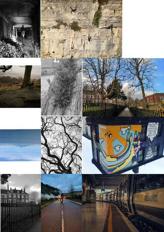
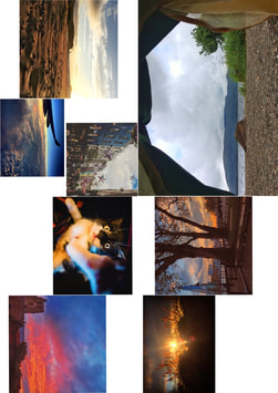
16 page Zine
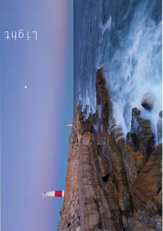
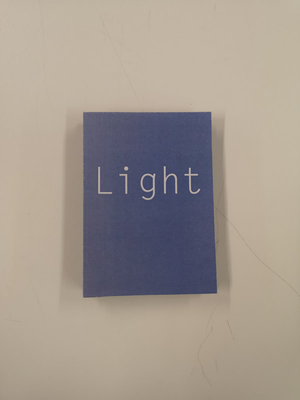
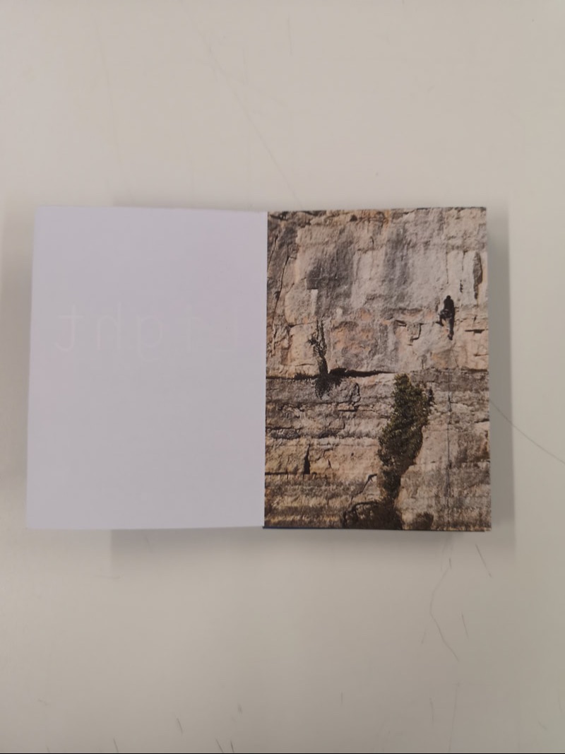
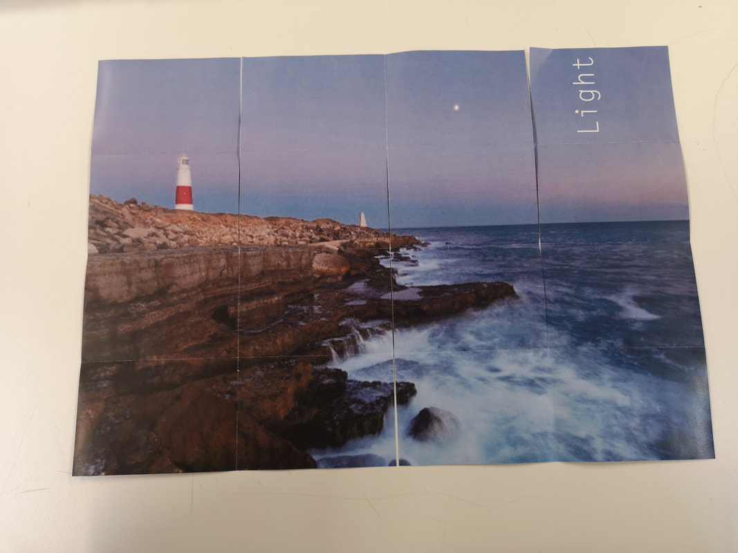
In response to looking at the photobooks, I made my own zine on photoshop. The images I chose had to be laid out in a specific way so that when they were printed it could be folded into an effective zine. This meant that some images had to be upside down because of the way the page was folded. On the other side of the page, I had one large image so that when it was unfolded a larger poster was created. This image also supported the front and back cover. I chose to call my zine 'Light' because the main poster included a light house, but also the whole project revolves around and comes from the sense of light.
|
|
|
|
|
|
|
|
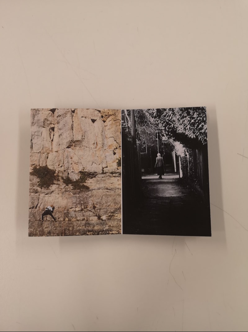
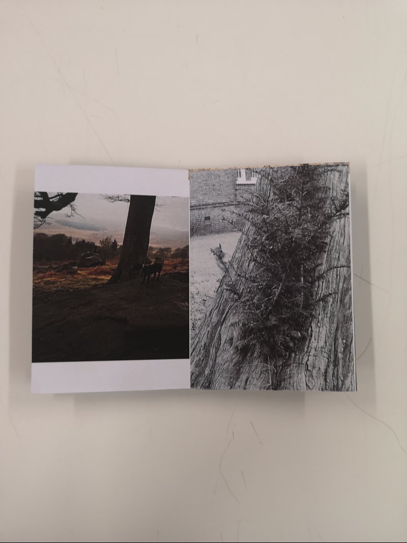
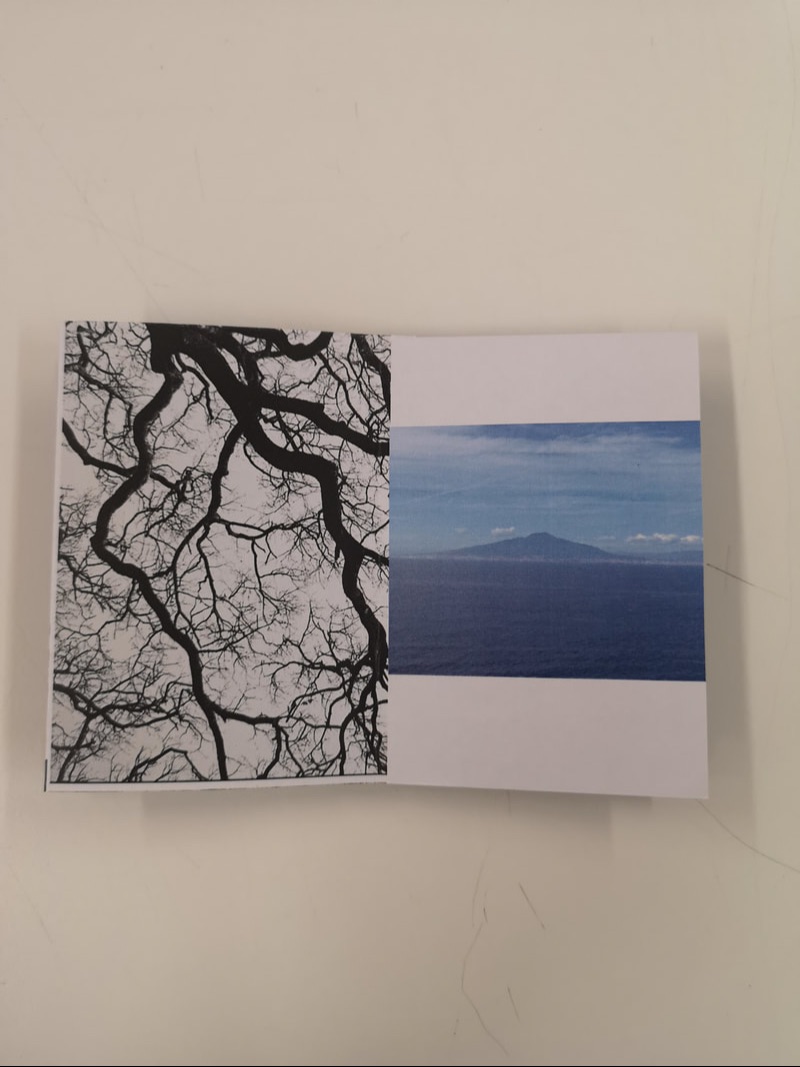
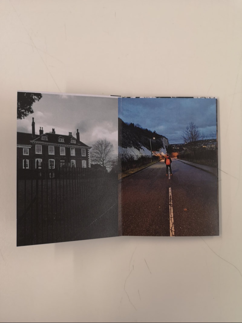
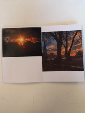
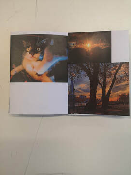
This zine was folded in a different way to what I have previously tried and included a lot more cuts to be made. I didn't like this way of creating a book so much because it meant that it didn't feel as sturdy and could lose structure and fall apart easier.
Despite this, I think it went well because you can go through the book and see the layout of images. I tried to make sure that some pictures fit the page differently, with some landscape pictures filling up 2 pages, some only taking up 1 and the first image went across 2 pages, I also included a square image which created more white space and different dimensions within the zine. I also tried to include a variety of images to make me
Despite this, I think it went well because you can go through the book and see the layout of images. I tried to make sure that some pictures fit the page differently, with some landscape pictures filling up 2 pages, some only taking up 1 and the first image went across 2 pages, I also included a square image which created more white space and different dimensions within the zine. I also tried to include a variety of images to make me
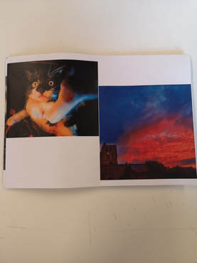
8 page Zine
|
|
|
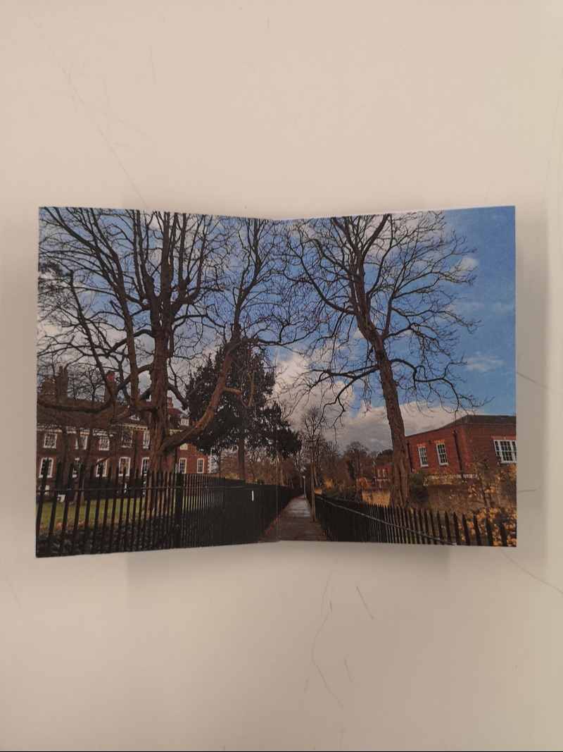
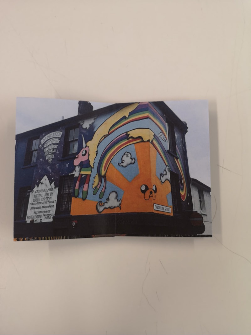
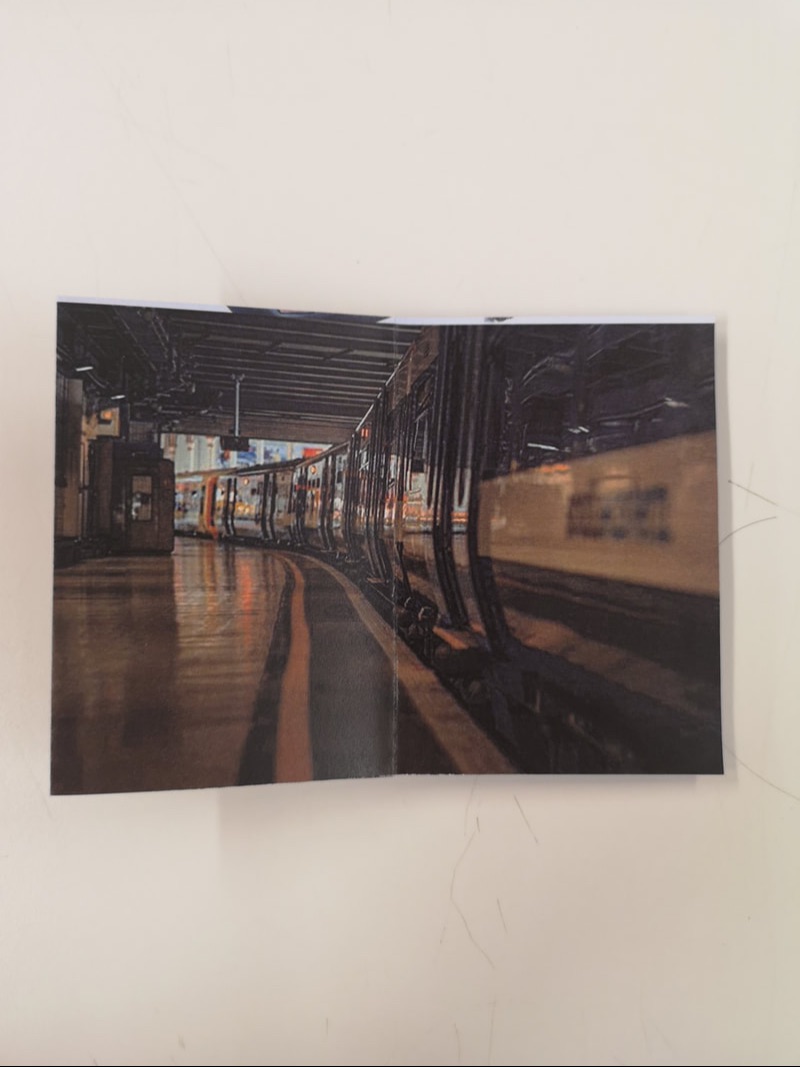
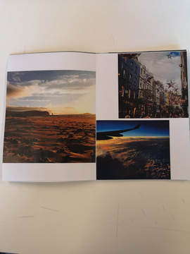
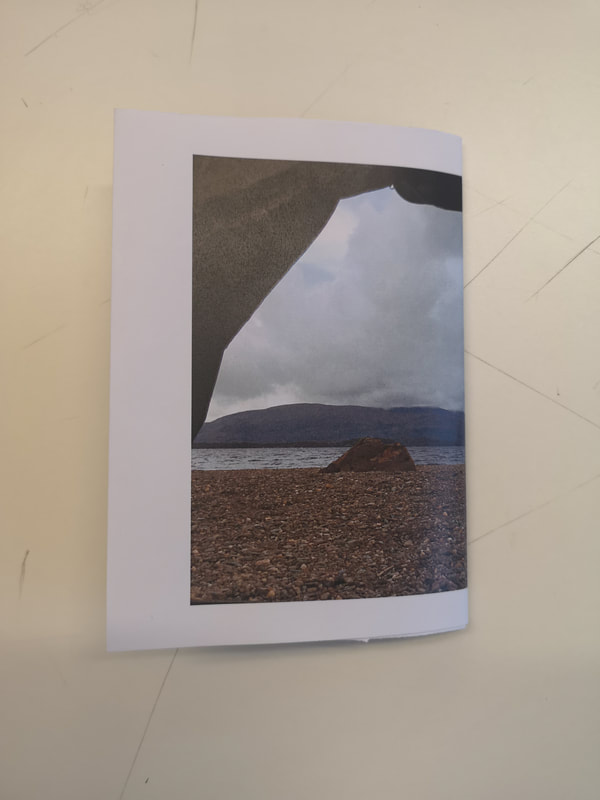
To make this zine I decided to do a different layout to the first, making only an 8 page zine. I preferred this template because I felt that the layout was more sturdy and structured. Because I didn't have to worry about the more complex layout that the pictures had to go in, I felt I could focus more on the composition of the images and the way they were presented within the zine. However, while this layout was easier to work with, I did not have the larger poster style image on the back which I felt was a nice aspect. I could however find a way to incorporate it onto the inside of this style zine. I didn't include a title this time so next time I will think about a suitable name and a. way I could present it.
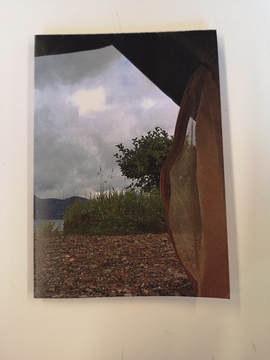
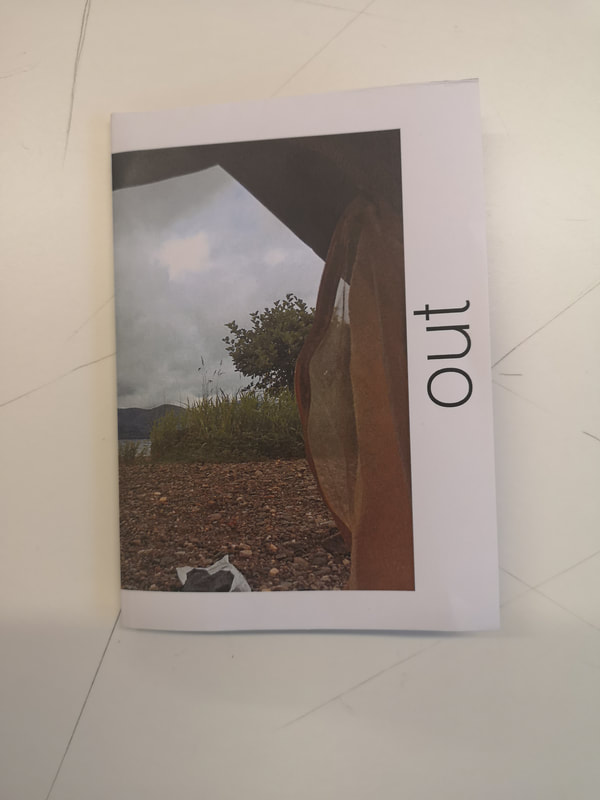
Re-making
|
|
|
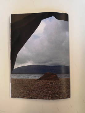
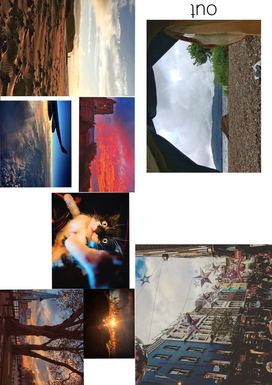
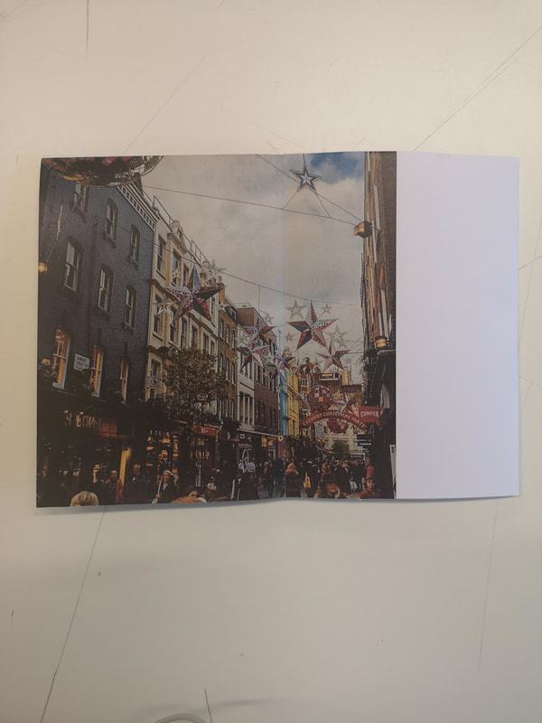
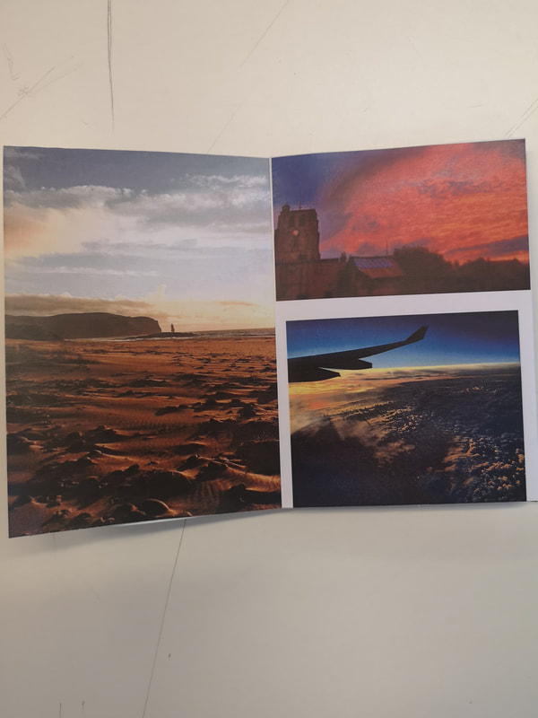
I decided to look at my zine and think of a way to make it more interesting and varied. I decided to use all the same images from the original however i cropped them and used them to fill the space in a different way. I made the front cover image smaller so that there was a white border around it. It is in this white space that I included the title. I chose to call the zine 'out' because all the images are taken when I've been out and travelling, including images from just being out in London, camping in Scotland and visiting family in Suffolk. I felt that these images all fit together because they contribute to memories and time spent away from home. In my first try at this zine, I didn't crop the images to fit the page, and instead just inserted them how they were, however in this one I thought closer about the layout and the way I could use white space to make the pages look interesting but also work together. I think this is my most successful zine because the composition of the images was more thought through and allowed the images to fill the page in a different way.
